![image test](https://res.cloudinary.com/dxtmlv91x/image/upload/c_limit,w_2000/f_auto/q_auto/v1/vicencio-project/vicencio-01.jpg?_a=BAVCyMGd0)
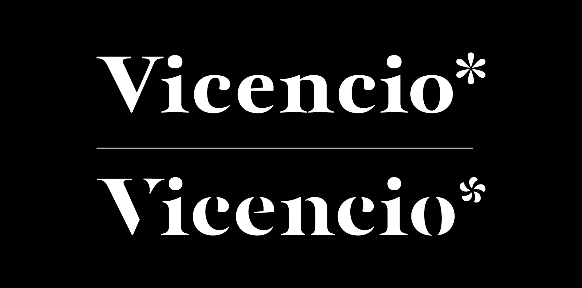
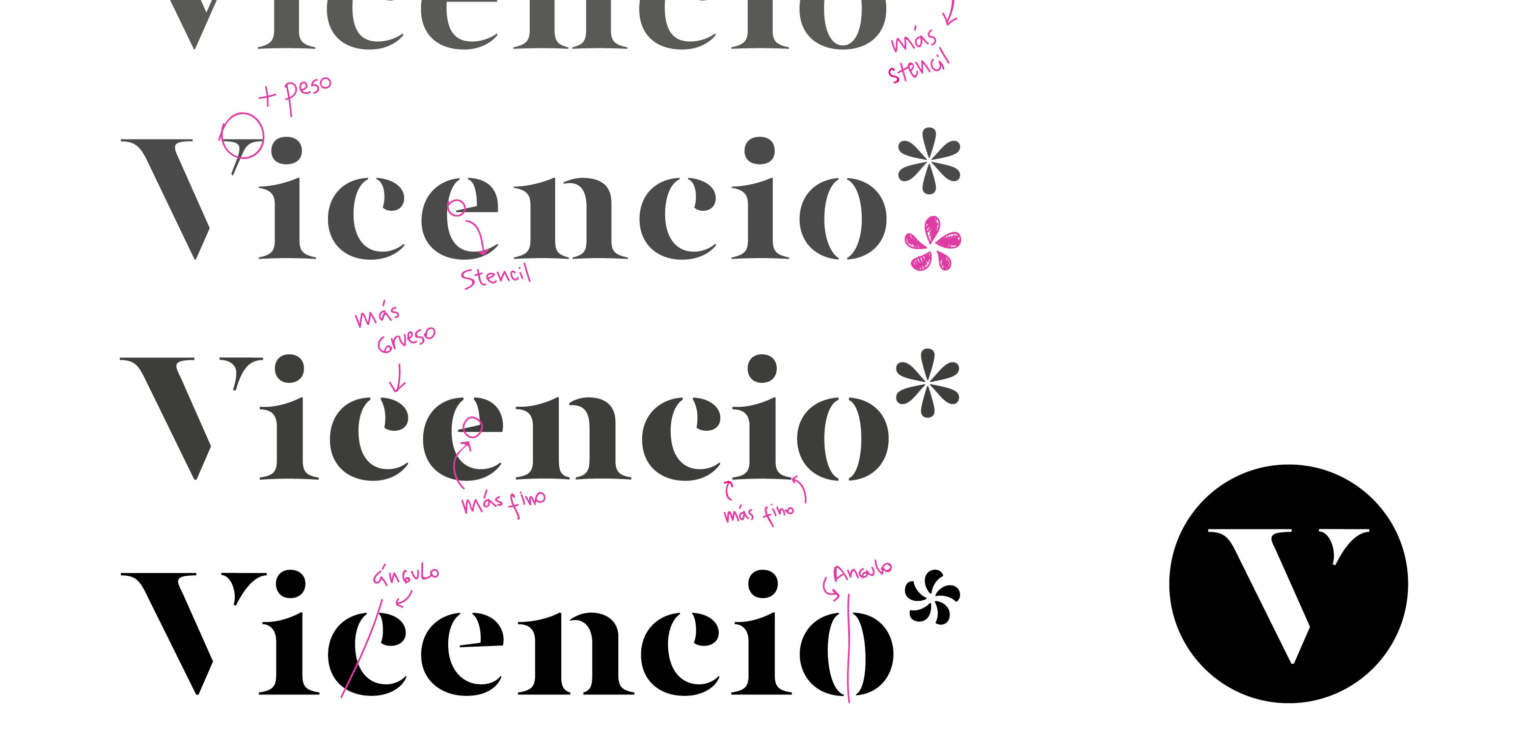
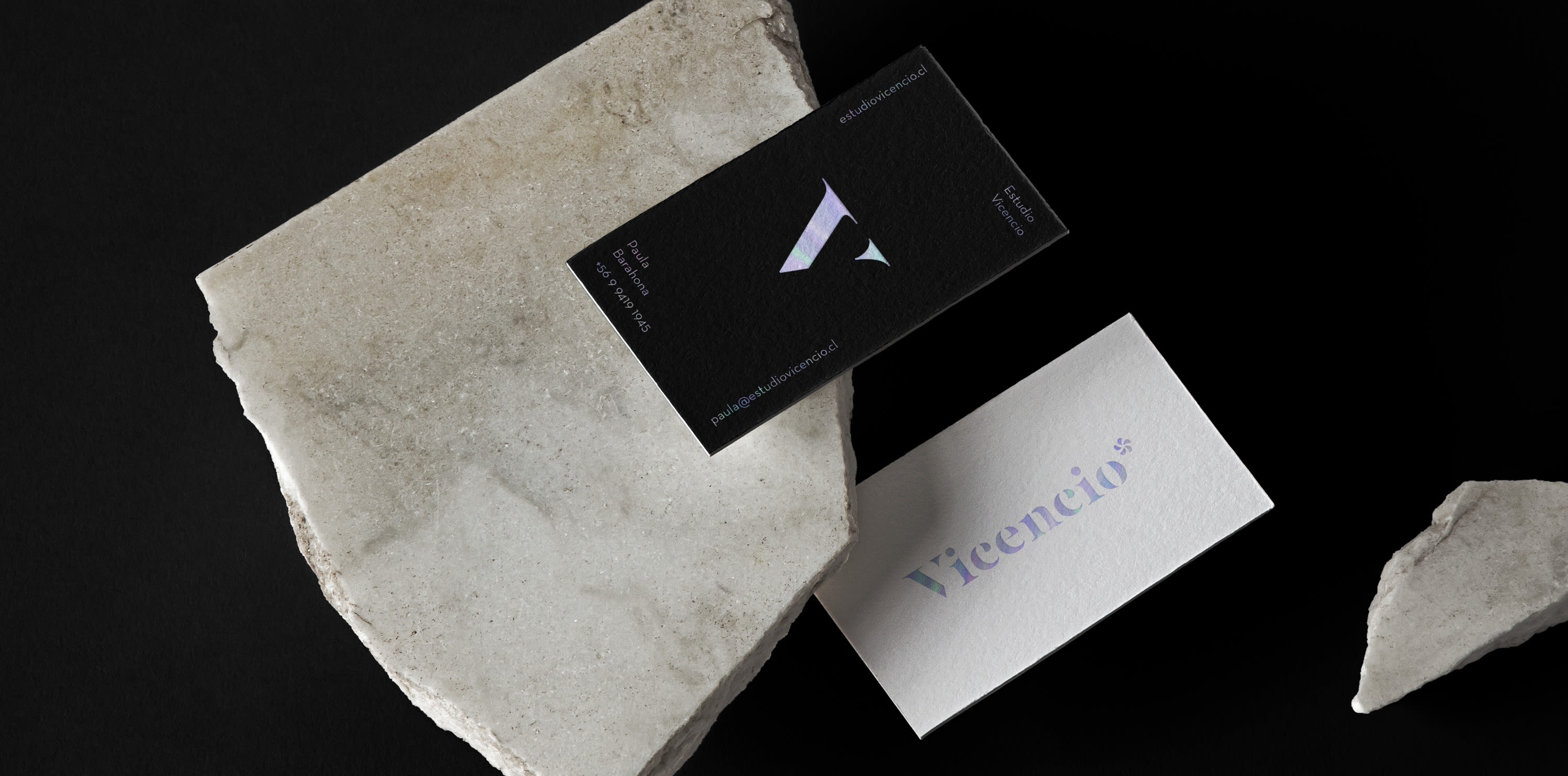
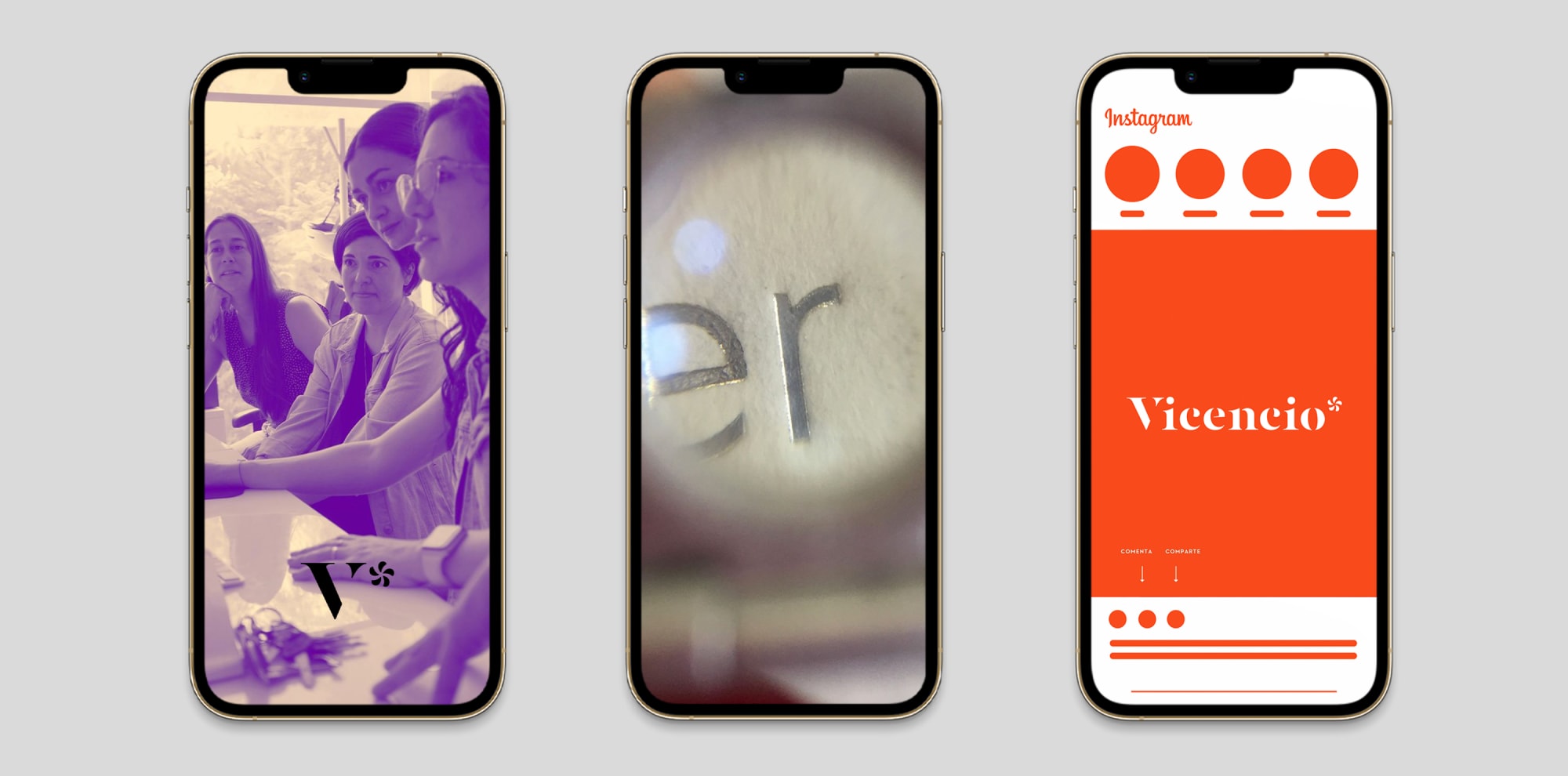
The assignment was to design a typography, with a dynamic spirit and close relation to the movements of the "kneading" process in the world of pastry. Bold shapes and complex counterforms to solve, were the most complex processes -and at the same time fun- because the typography contemplated uses related to headlines, packaging and labels, which could provide identity and play together with the branding proposal.
![image test](https://res.cloudinary.com/dxtmlv91x/image/upload/c_limit,w_2000/f_auto/q_auto/v1/vicencio-project/vicencio-02.jpg?_a=BAVCyMGd0)
![image test](https://res.cloudinary.com/dxtmlv91x/image/upload/c_limit,w_3000/f_auto/q_auto/v1/vicencio-project/vicencio-03.jpg?_a=BAVCyMGd0)
![image test](https://res.cloudinary.com/dxtmlv91x/image/upload/c_limit,w_3000/f_auto/q_auto/v1/vicencio-project/vicencio-04.jpg?_a=BAVCyMGd0)
![image test](https://res.cloudinary.com/dxtmlv91x/image/upload/c_limit,w_2000/f_auto/q_auto/v1/vicencio-project/vicencio-05.jpg?_a=BAVCyMGd0)
![image test](https://res.cloudinary.com/dxtmlv91x/image/upload/c_limit,w_3000/f_auto/q_auto/v1/vicencio-project/vicencio-06.jpg?_a=BAVCyMGd0)
![image test](https://res.cloudinary.com/dxtmlv91x/image/upload/c_limit,w_2000/f_auto/q_auto/v1/vicencio-project/vicencio-08.jpg?_a=BAVCyMGd0)
![image test](https://res.cloudinary.com/dxtmlv91x/image/upload/c_limit,w_3000/f_auto/q_auto/v1/vicencio-project/vicencio-07.jpg?_a=BAVCyMGd0)